The page summaries that include thumbnail images on my wife’s web site also needed to be responsive to site visitor’s device characteristics.
Following the Hugo shortcode developed for embedding responsive images within pages as part of adapting to visitor’s devices on my wife’s web site there were still two problems: the project summary pages and the header background images.
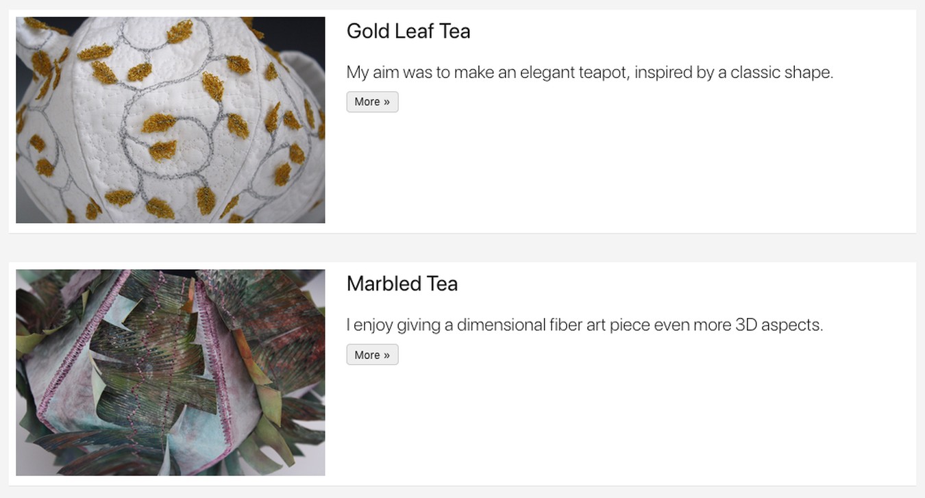
Her website includes Hugo generated summary pages with thumbnails of the art as a featured image for each project. Like these examples from her gallery of fabric art teapots.
That gets used to build page summaries that include featured_images, like the one below.

Summaries with thumbnail featured images
I needed not only to create responsive versions of the images for the pages themselves but also for the Hugo list pages that included summary-with-images. Being a relative Hugo novice I first thought I could use the existing shortcode but some digging taught me that was not going to work as part of a Hugo template; I needed a partial.
My first attempt was the probably all too typical ‘copy and paste’
version. But that taught me how little I still grasped some of Hugo’s
concepts. After some debugging I ended up with this img-srcset.html partial
That gets used in a variation of the theme’s
layouts/partials/summary-with-image.html partial like this:
...
{{ if .Params.featured_image }}
  {{ $featured_image := (path.Join "images" $featured_image) | absURL }}
  <div class="pr3-ns pl2 mb2 mb0-ns w-100 w-40-ns">
    <a href="{{ .URL }}" class="db grow dim">
      {{- $.Scratch.Set "image" $featured_image -}}
      {{ partial "img-srcset.html" . }}
    </a>
  </div>
{{ end }}
...
Next up: adaptive sizing of those images used as the background pages' titles and descriptions for the top sections like above.