Following the initial optimization of images on my wife’s web site it was time to look into improving the responsive image situation for mobile devices.
Initially I had planned on scripting the responsive image generation, perhaps as part of a git hook. But the Hugo framework added image processing support. I had thought that adopting Hugo’s image handling would require a major restructuring to use page bundles. But then I discovered that existing pages could reference images in headless bundles where Hugo’s image resource handling would still work.
Using HTML5’s picture element with srcset’s is the modern way it seems. So I set about adapting what I could find from some others' explorations in this area.
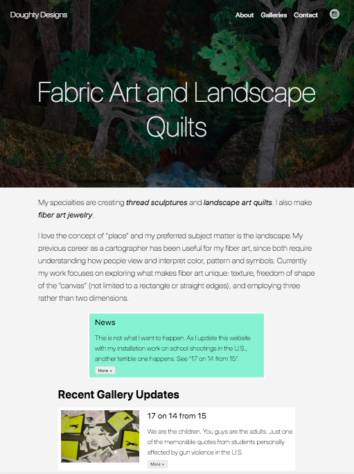
Below is an image of the reimplemented web site, using Hugo’s native figure shortcode that provides a single image src.

Image using Hugo's native figure shortcode
While below is the result of a replacement ‘image’ shortcode that uses
a <picture> HTML element generated by some hand-tooled code to create
the markup at the same time that Hugo’s
image processing methods
are used to iteratively generate resized images.
The results should be responsive images and web pages that
enable users' browsers to get the optimal (for their device) image size.

Image using picture, source, srcset ...
Check your page source / developer tools to see browser selected image resolution
The shortcode for that in the page content, which otherwise uses markdown syntax, ends up looking like
{{< image src="DoughtyDesignsRedux.jpg"
    title="Image using picture, source, srcset ..."
    caption="Check the page source / developer tools to see browser selected image resolution"
    alt="The same image whose resolution was selected based on device media" >}}
What that generates, including the referenced resized images looks like the following HTML.
<div class="picture">
  <figure>
  <img srcset="/media/images/DoughtyDesignsRedux_hu9475e40123017607cf3e014e405fbc8c_302595_600x0_resize_q90_lanczos.jpg 600w,
               /media/images/DoughtyDesignsRedux_hu9475e40123017607cf3e014e405fbc8c_302595_900x0_resize_q90_lanczos.jpg 900w,
               /media/images/DoughtyDesignsRedux_hu9475e40123017607cf3e014e405fbc8c_302595_1200x0_resize_q90_lanczos.jpg 1200w,
               /media/images/DoughtyDesignsRedux_hu9475e40123017607cf3e014e405fbc8c_302595_1350x0_resize_q90_lanczos.jpg 1350w"
    sizes="(max-width: 1350px) 50vw,
           (max-width: 1200px) 50vw,
           (max-width: 900px) 50vw,
           (max-width: 600px) 50vw,
           900px"
    src="/media/images/DoughtyDesignsRedux_hu9475e40123017607cf3e014e405fbc8c_302595_1350x0_resize_q90_lanczos.jpg"
     title="Image using picture, source, srcset ..." alt="The same image whose resolution was selected based on device media" ><figcaption>
      <h4 class="b fw6">Image using picture, source, srcset ...</h4>
      <h4 class="i fw4">Check the page source / developer tools to see browser selected image resolution</h4></figcaption>
    </figure>
  </div>
<p>
Finally, the actual Hugo layouts/shortcodes/image.html code for that ended up looking like:
Next up: responsive sizing of images used as part of article summaries.